In recent years, websites and apps have been offering users the option to toggle between light mode and dark mode, and it’s more than just a style preference. Whether you’re planning a new website or optimizing your existing one, the choice between light and dark design can influence user experience, engagement, and even accessibility.
So which one is better for your customers? Let’s look at what each mode offers and how it could impact your business.
1. Light Mode: Clean, Familiar, and Bright
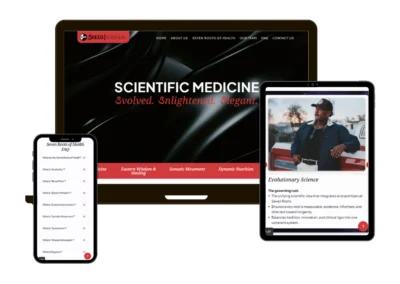
Light mode has been the default for decades, white or light backgrounds with dark text. It’s familiar, straightforward, and offers strong readability in well-lit environments. Many brands still prefer this mode because it feels open and professional.
Takeaway for business owners: If your audience is older, more traditional, or browses mostly during the day, light mode may feel more comfortable and trustworthy.
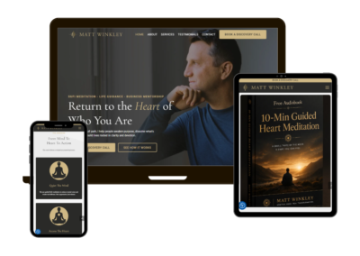
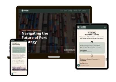
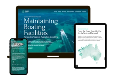
2. Dark Mode: Modern, Sleek, and Easy on the Eyes
Dark mode reverses the typical color scheme with dark backgrounds and light text. It’s become popular thanks to apps like Instagram, YouTube, and operating systems offering dark themes. Users often find it easier on the eyes in low-light settings, and it can give a tech-forward, modern feel to your site.
Takeaway for business owners: If your brand caters to younger users or creatives, or if your site is frequently used at night, dark mode might offer a better experience.
3. Eye Strain and Readability: It Depends on the Context
Dark mode reduces glare and can feel less tiring in dimly lit environments. However, it’s not ideal for everyone. Long passages of light text on dark backgrounds can sometimes be harder to read, especially for users with certain visual impairments.
Takeaway for business owners: Consider who your users are and when they visit your site. Context matters more than which mode is trendier.
4. Battery and Performance Impact
For mobile users, dark mode can help save battery life, especially on OLED screens where black pixels use less power. While the savings aren’t dramatic for all users, every bit helps when optimizing mobile performance.
Takeaway for business owners: If your users are mostly mobile-first, dark mode could contribute to a longer, smoother browsing experience.
5. Accessibility and Inclusivity
High contrast doesn’t always mean more accessible. Some users with dyslexia or other visual conditions may struggle more with light-on-dark text. That’s why many apps and websites now offer toggle options for users to choose what works best for them.
Takeaway for business owners: If your site serves a wide range of users, consider offering both light and dark modes. Giving your audience control is always a win.
Final Thoughts: Give Your Users the Power to Choose
There’s no one-size-fits-all answer. Both light and dark modes have their strengths, and your best bet is to meet users where they are. Whether that means choosing one mode that suits your brand or offering a toggle for both, the goal is to create a comfortable and enjoyable experience.
Need help designing a site that feels right in both modes? We’ve got you. Contact Us. Let’s build something beautiful, in light or dark.