What is needed?
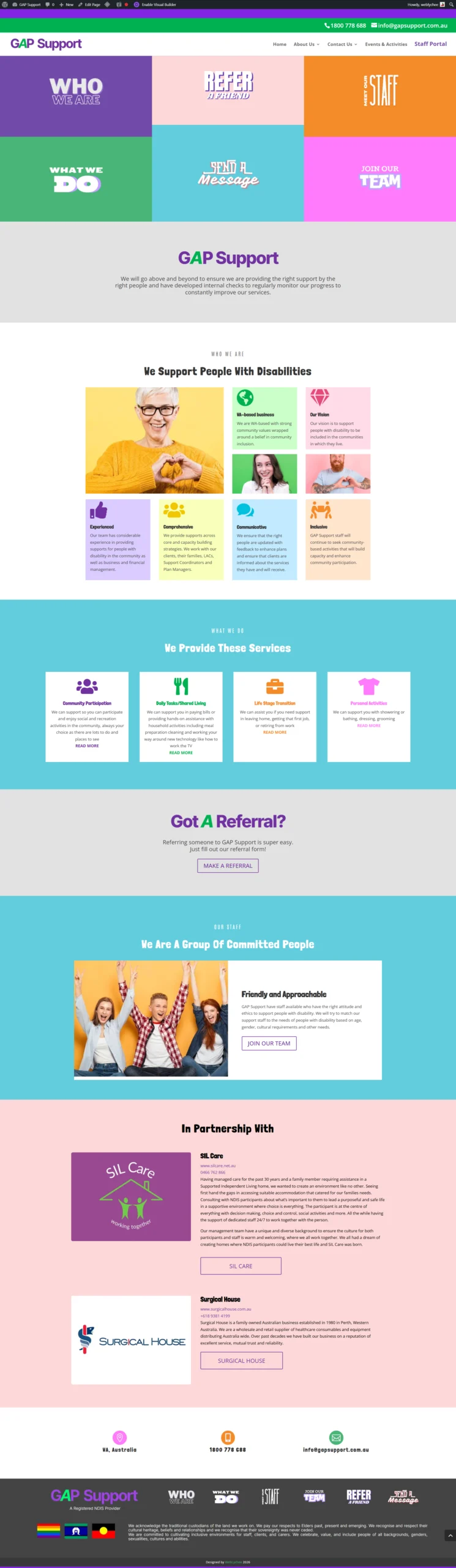
The existing GAP support website was characterized by a plain and outdated design that failed to resonate with the brand’s youthful and vibrant customer base. The site lacked visual appeal and did not effectively engage its target audience, making it feel disconnected from GAP’s brand identity.
Recognizing these shortcomings, the client approached us with the goal of redesigning the website to reflect a more youthful and energetic vibe. They requested a fresh, funky theme that would not only modernize the site but also align with GAP’s reputation for trendy and stylish products. The challenge was to transform the website into a visually striking and engaging platform that captures the attention of younger users, all while maintaining usability and functionality across various devices.
Our solution
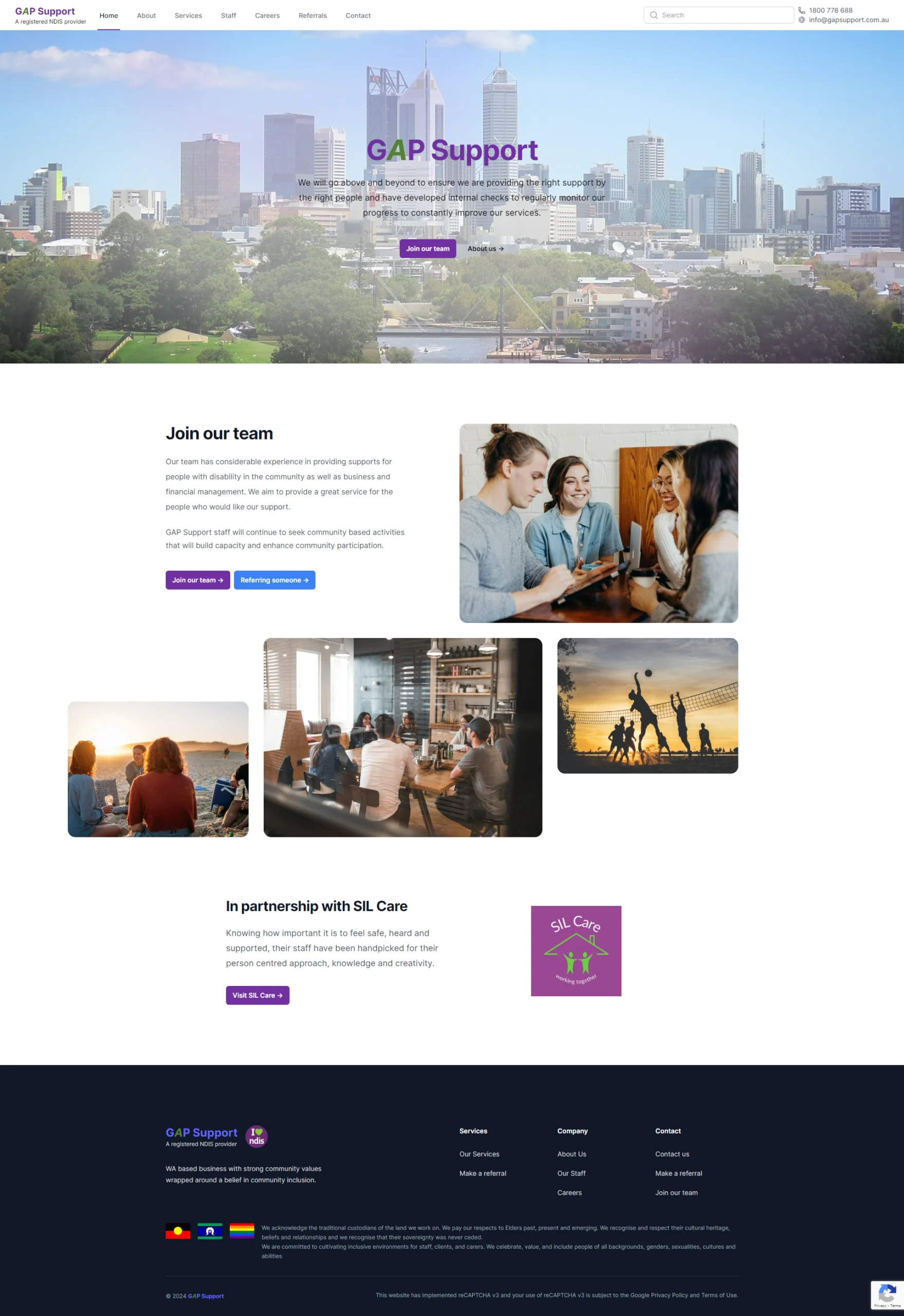
To address the client’s request for a more youthful and energetic website, we undertook a comprehensive redesign of the GAP support website. We began by completely reimagining the layout, moving away from the plain, conventional structure to a more dynamic and engaging design that resonates with the target audience.
A key aspect of this redesign was the strategic use of vibrant colors and playful fonts, carefully chosen to evoke a funky and modern aesthetic. We balanced these bold elements with a clean and streamlined interface, ensuring that the website remains visually appealing without becoming overwhelming. This delicate balance was essential to maintain usability and accessibility while delivering the desired youthful vibe.
In addition to the color and typography updates, we introduced curved lines and organic shapes throughout the design. These elements were specifically incorporated to convey a sense of spontaneity and movement, reinforcing the energetic and lively theme the client envisioned. The use of curves also helped to soften the overall look, making the site feel more welcoming and less rigid.
Despite the incorporation of various colors and design elements, we ensured that the site maintained a modern and polished appearance. The result is a vibrant, yet clean, user experience that captures the essence of GAP’s brand while engaging a younger, trend-conscious audience.
Before
Hover on the images to scroll
After
Hover on the images to scroll